
Do I Crop? If so, when?
/
Knowing when and how to crop is part of the creative process. if you only doing it to fit a picture frame, you are making a mistake
Read MoreWelcome to The Photo Video Guy. I share training, ideas, opinions and tips to help you make better photographs and videos.
Have questions? Excellent! Please click this link to fill out the simple form to submit a question
Knowing when and how to crop is part of the creative process. if you only doing it to fit a picture frame, you are making a mistake
Read MoreHello folks. The subject of cropping images has come up again recently so I thought it was a decent time to take a whack at the topic.
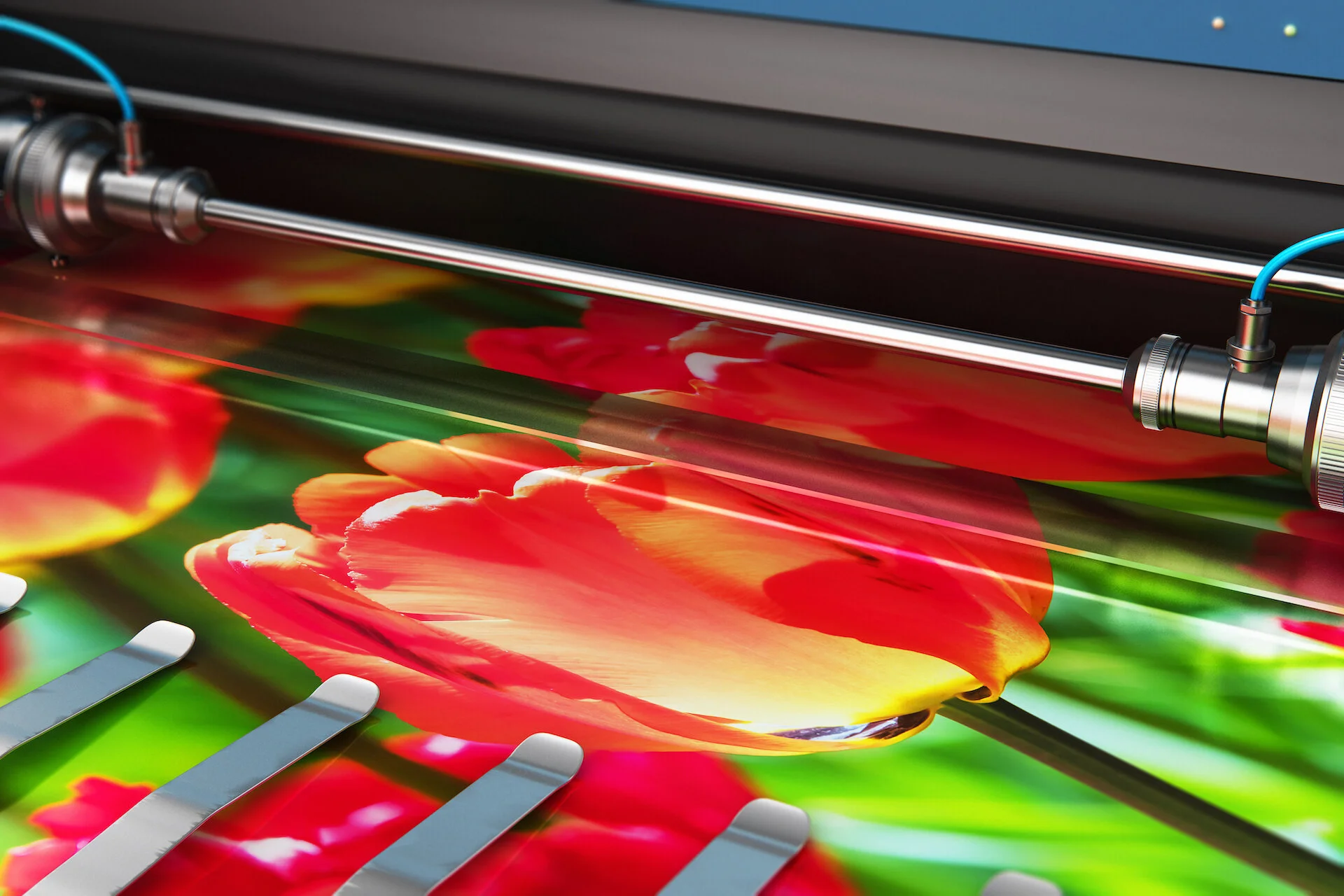
Read MoreSelecting the correct dots per inch value when printing your own photos directly or for preparing a print file to send to an external printer is very important. There is a lot of chatter on the Internet that says choose 300 dpi, set and forget. For small prints, this makes sense, but will result in large files and significant use of ink unnecessarily for larger prints. It behooves any photographer who prints to understand DPI and how to determine the optimal settings.
Read MoreThose who like editing invariably look at calibration tools. They do a great job but many users aren’t happy with the results especially when printing. Why didn’t the calibration device work?
Read MoreLearning to print at home can make you a better photographer. Learn why here
Read MoreIn case you had not heard, Costco has announced the closing of the Photo Centres in many of their US based stores. Costco does not process film. They make prints. They can put those prints in frames or in books or on greeting cards. The common element is the print.
So who cares? You should and if you don’t you may have earned your Fool badge
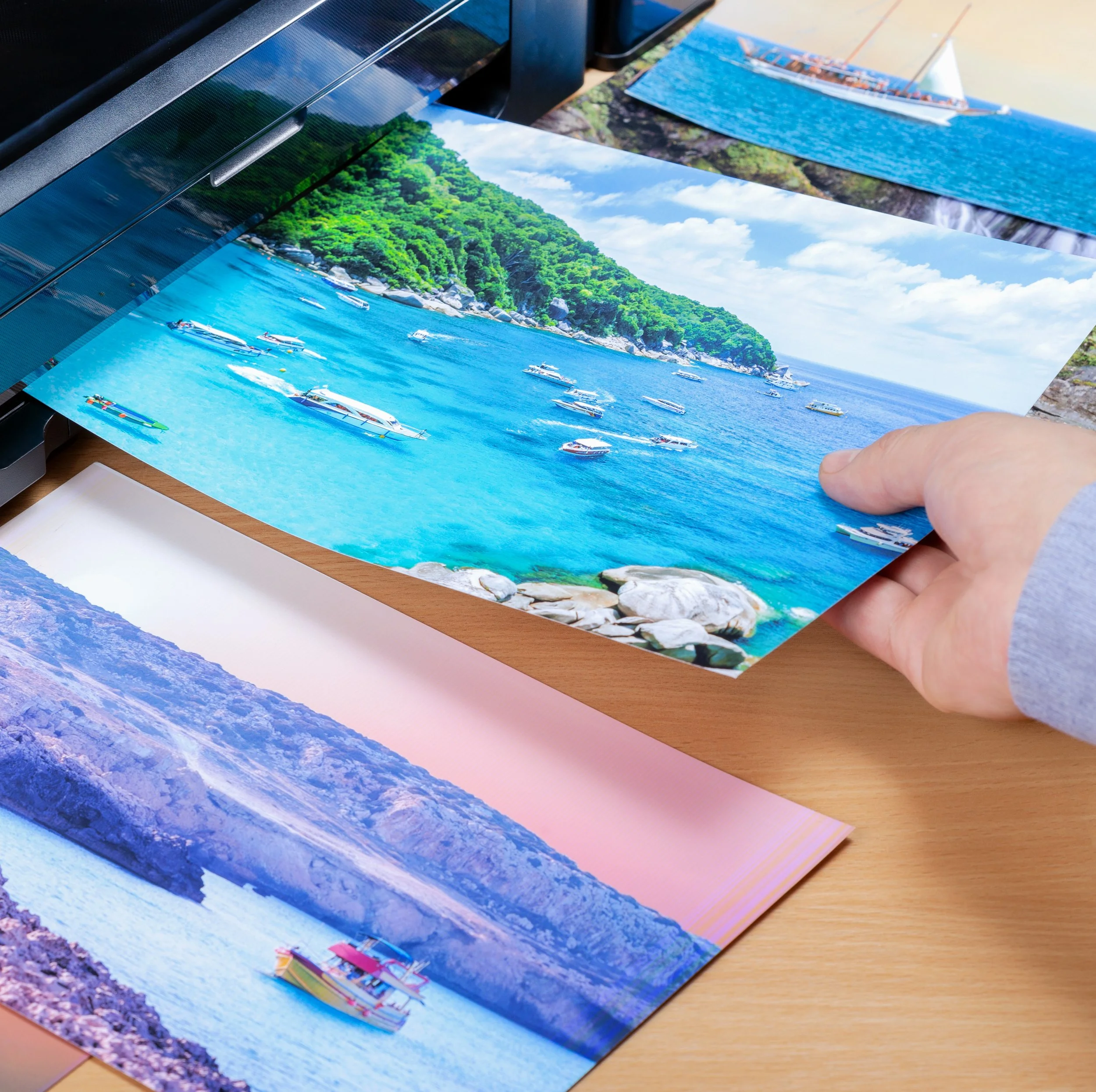
Read MoreMore photographers and snap shooters are printing! Hooray! A photograph is not finished until it is printed. With an increasing number of folks realizing that pictures go to die on your smartphone, on your computer and on social media, the volume of prints is going up. And that has raised some concerns not experienced in the on screen only world. In this article, we will look at a few issues and propose some solutions for them.
Read MoreIt'stime to review the concepts of this subject again. When it comes time to make photos ready for print there remains a lot of misinformation that's causing frustration amongst photographers.
Read MoreWhy do we stick to standard cropping ratios? Why don't we crop more of our images? Let's explore these and other questions together.
Read MoreI believe that a photograph that is not printed is incomplete. An image that is not printed is sentenced to death on a hard drive somewhere, or buried in an endless stream of snapshots on a tiny phone screen. Given the alternatives, death is bad. In many cases, a single print, however wonderful, does not tell a complete story. This is where a proper album comes into play, and to solve that problem, we have Fundy Designer.
Read MoreThis past weekend I taught a hands-on workshop for my local camera club on photo restoration. Restoration is a very deep topic and what one can accomplish in a half day long workshop is limited to core techniques and the delivery of a handbook with a number of technique recipes for people to try as they work through restoration projects.
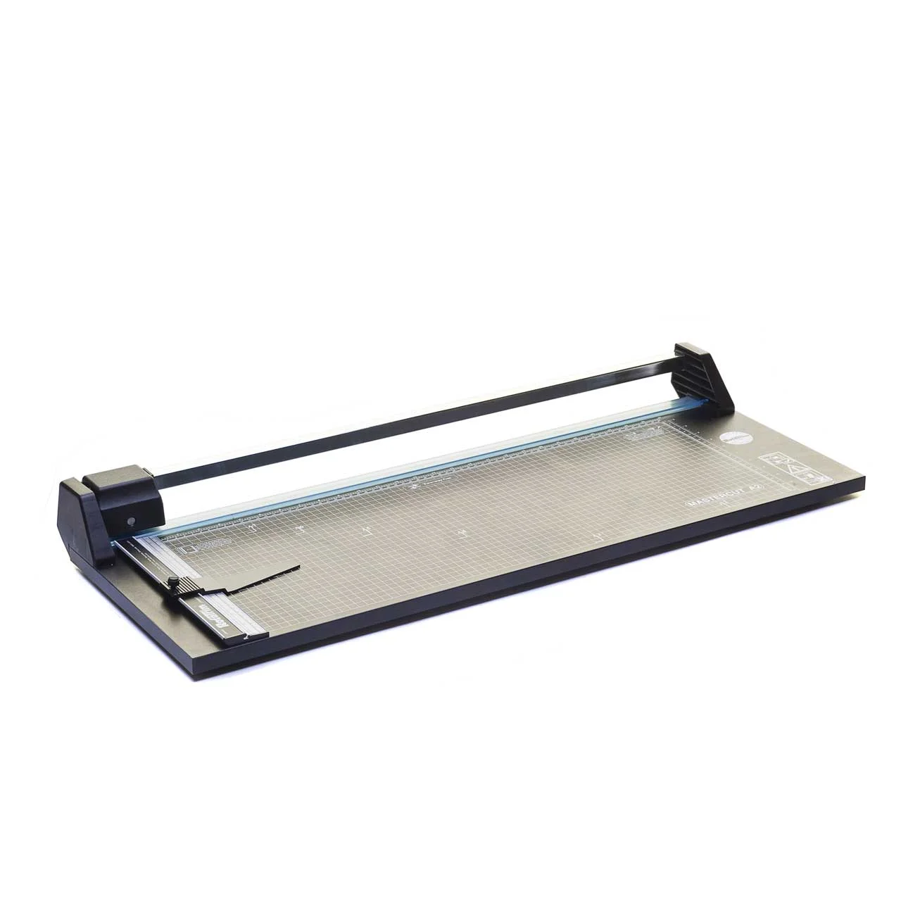
Read MoreI accept up front that paper cutters don't fit a need for everyone. But if you print, at some point you will need a good paper cutter, and I want to save you some pain and money by helping you buy your last cutter first.
Read MoreOn Saturday November 20th 2015 I was invited by Henry's Newmarket to deliver a seminar on the theory and practice to make great photographic prints, whether you print yourself or prepare your images to be handled by a lab. I've done this video for those who wanted a reference and for those who could not attend.
Read MoreI have a shoot coming up where I need to provide 4x6 prints to the client's guests nearly immediately after making the photographs so they can take the photo with them that evening. Research led me to the Canon CP100 printer, a dye sublimation system that puts paper and dye sub film into a single box. My MacBook Pro runs El Capitan, the current shipping operating system from Apple. As I have found in the past, Canon's installer is OS version specific, even when it makes no sense to do so. I would be stuck, except for Pacifist.
Read More As I've been looking at alternative ways to display prints, I came across this item called Stick & Stretch Gallerie Wraps. Or at least that's what they are called in Canada. In the United States, you'll find them under the brand name Hahnemuhle Gallerie Wrap. Different packaging, same thing.
Basically they consist of four sticks, 1 ¼ wide in the Standard version and 1 ¾ wide in the Pro version. Each stick has an adhesive strip pre mounted, is beveled at the corners and is notched to fit into these moulded corner braces. You need a set of corner braces to make the system work, so your first purchase should be a Starter Pack that contains four sticks, reusable corner braces, a bottle of archival glue and some corner pins that look a lot like big heavy staples.
As I've been looking at alternative ways to display prints, I came across this item called Stick & Stretch Gallerie Wraps. Or at least that's what they are called in Canada. In the United States, you'll find them under the brand name Hahnemuhle Gallerie Wrap. Different packaging, same thing.
Basically they consist of four sticks, 1 ¼ wide in the Standard version and 1 ¾ wide in the Pro version. Each stick has an adhesive strip pre mounted, is beveled at the corners and is notched to fit into these moulded corner braces. You need a set of corner braces to make the system work, so your first purchase should be a Starter Pack that contains four sticks, reusable corner braces, a bottle of archival glue and some corner pins that look a lot like big heavy staples.
If you've ever done a Gallery Wrap the old way, with stretcher pliers and staple guns and hot glue, you know that while the final outcome can be beautiful, getting there is often arduous and frustrating. Hence this kit.
There are a couple of videos on the web that show how to use the kit, one from Photoplus in 2010 with the inventor, and one with Phil Neilsen from Amplis Canada. Both are excellent, Phil's is a bit easier to follow.
Making It Happen
Thoughts
This is really dead simple. My first one lost some tension about ten minutes after setting up, and that's why I added the step using the roller. The second one remains taut as a drumhead. The pricing for the sticks is pretty reasonable considering that they are all preformed and predrilled, the adhesive is decent, the archival glue works well and the staples are easy to work with. You will need to buy at least one starter kit for each format to get the proper corner blocks but once you have them, you're good. You can also buy glue as a standalone product as well as sacs of extra staples.
If you want to see someone do this before you buy, watch Phil's video on the Amplis Store page here.
---
Followup a day later. I've changed my description of the strip adhesive from good to decent. It doesn't stick consistently and to my disappointment, both wraps have sections that became unstuck. So I'm changing my rating and going to call the company tomorrow to vent a bit.
I'm one of those photographers who thinks that a photo is only truly complete when it becomes a print. There's something very special about holding a piece of art in your hands, a tactile experience very different, and in my opinion, superior to seeing it on screen. I was recently listening to an interview with Tokyo based wildlife photographer Martin Bailey and he was raving (again) about Breathing Color paper and canvas. I went online and tried to place an order as they only sell direct, but when the company got back to me, shipping was going to be more than the cost of the paper. I live in Canada, and I guess sending stuff from parts of the USA is akin to launching a rocket to Mars. That's not true for Red River Paper, they process orders and all the costs are included at excellent pricing, but I digress.
A tech support person at Breathing Color advised me that Amplis in Canada sold their paper direct. Amplis has an online store so I went to it. No Breathing Color. It only appeared on the Dealer secure site. I wrote back to Breathing Color and told them their Canadian option seemed broken. The same young gent contacted Amplis and I was contacted in short order by Phil Neilsen and Pat Cameron. Phil sells for Amplis. Pat is on the order desk. Both were very helpful. Pat processed my order and I picked it up, with only a couple of hiccoughs, the same day.
I ordered five 17" x 20' trial rolls. The new metallic paper was not in stock but the others were so I collected them. Lyre Canvas, Crystalline Satin Canvas, Vibrance Matte and Optica One were my selections. This morning I had some time and so unloaded the default roll of Epson Professional Premium Lustre that I typically have queued up in my printer. After loading the roll of Crystalline Satin, I set to making some prints.
I love the Epson 4900 but it has its quirks. Single sheet canvas handling is one of them. Once I got the roll loaded and feeding properly, (more challenging than it should have been), I read the insert that came with the paper. Breathing Color not only supplies setup instructions for Windows and Mac for their papers, they include screenshots to help you out. Of course the screenshots did not match my world exactly, but there was more than enough information to create a printer preset for the roll of Crystalline Satin.
One of the other things I really like about Breathing Color is that when you go to download their ICC profile for a paper, the download contains all their ICC profiles in a single package along with an aliased installer to make installing them completely painless. Every other paper company SHOULD learn from this simple and very customer-centric step.
Lightroom 5.2 was used to make my prints. Two shots were in colour, shot on a Canon 1D Mark IV with the 100-400 and 1.4x teleconverter, the first of a giant panda and the second of an african rhinoceros. The third was a scan of a 4x5 TMAX 100 negative shot with a Nikkor 210mm on my Sinar P that I had processed earlier this week. I thought it would be nice to try these different subjects on canvas.
Despite a first time feed error, once I unloaded and reloaded the canvas, the Epson 4900 did the job I bought it for. It produced great prints in a reasonably timely fashion. I liked very much that the ICC profiles worked flawlessly with Lightroom's proof print function and that I could see what the prints would look like before printing. I have had issues where this did not work properly with other vendor's ICC profiles. I keep my displays calibrated using a Color Munki Photo so I got out what I saw on screen after allowance for reflective textured media vs backlit display.
The canvas is very thick and Epson advises not to use the built-in cutter for canvas on the 4900. I set the printer for no cut, and learned how to advance and then withdraw the paper once I cut it with an X-Acto after each print. The 4900 does a great job of prepping the roll and my not straight cuts caused no issues with the next prints.
Once the pigments had dried for a while, I sprayed each print with Hahnemuhle's spray canvas protector. You have to do this outside unless you want to go on a coughing jag. Once the varnish was dry enough for handling, I took a tip from friends Kathy Constantinou and Simeon Tse and mounted the prints on foam core.
My usual response to printing is to frame stuff, but I had done an experiment with mounting a Moab Metallic Pearl print on foam core and I liked the outcome very much. I have not yet bought gallery mount kits for canvas, (next week, Amplis has some great kits), so I thought, what the heck? I sprayed the back of the canvas with 3M photographic spray cement and then placed the prints on the foam core. I covered the print with parchment paper and used a rubber roller working from the centre out to lay the canvas down on the foam core and roll it flat. It worked surprisingly well, so a big thanks to Kathy and Simeon for their initial coaching. Once the glue had set up a bit, I used a steel straight-edge and the heavy X-Acto to trim away the excess foam core. I bought a self-healing cutting mat at the Currys Art Supply store and it's perfect for this kind of work.
The canvas looks awesome. Colours are bright, gamut is excellent and the canvas texture is very appealing without degrading the image quality in any way. The black and white print from the Sinar looks stunning on the canvas. I spent a lot of time making the shot and while there is always room for improvement, I love that I can see ten zones in the image. Canvas is the perfect media for this kind of work.
I have not yet tried the other Breathing Color papers, but my first experience with their Crystalline Satin has been awesome. They make a really fine product and handle the software end better than most paper companies. Now that I know the trick to ordering the paper in Canada (call Pat at Amplis direct), I'll buy more in the future.


The site of The Photo Video Guy featuring articles, reviews, tutorials and a podcast for your enjoyment and skills development.
If you get value from here, please support the channel on Patreon. Once there, click Membership
Looking for something in particular? Search all the posts for the content you are seeking!
Have a question on photography or video? Click this link to send us your question.
Subscribe to our articles via RSS by clicking the link below.
Subscribe to the Make Better Photos and Video Podcast via RSS by clicking this link


Regular readers know that I am a big fan of Really Right Stuff products. Their customer service is superb. If you choose to purchase from them at their site, please let them know that I referred you.
The Photo Video Guy is the creation of Ross Chevalier. Please feel free to link to your site, but please don't lift content without attribution.