
White Balance and Colour Temperature - They Aren't The Same Thing!
/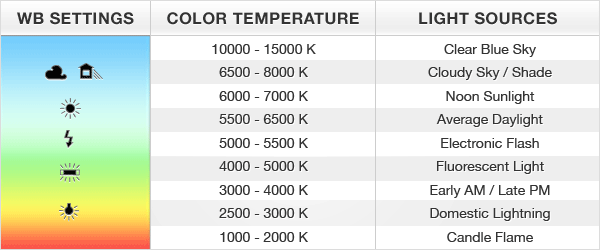
An approximation of white balance settings, light colour temperature measurements and sources. Note that these are all very wide ranges and not explicit. Graphic is copyright exposureguide.com provided by Google Images.
Over the last couple of weeks, I've run into a series of questions from folks pertaining to white balance and colour temperature. There is some confusion apparently around equating the two and I think that this is worth a conversation.
Colour temperature in the world of science is a measure of degrees Kelvin, with a fairly subjective overlay of associated colours. What we call the colours may differ from person to person, but the actual temperature number is always the number. Thus we will often see Daylight white balance referencing a colour temperature anywhere between 5200K and 7000K with some outliers to be found as well. The temperature of the light is what it is, what colour we call it is not particularly relevant other than to create an image in the mind of the person or group that you are talking to.
When we look at our photographic editing software, we encounter typically two controls. These controls make up two axes in a two dimensional square, with what is called temperature, but really is not, along one axis and what is called tint, but really is not, along the other. What we really have is an axis running from some level of yellow to some level of blue. While this is called temperature, it really is not. It's more of an estimate, a game of close enough, sort of like horseshoes. The tint axis is really a range of colours from magenta to green aligned perpendicularly to the yellow to blue axis. By this method, ostensibly you should be able to achieve any visible colour for your white balance.
It's important to note that neither of these sliders have any impact on luminosity. They are completely independent, or should be. If by moving one or both sliders, the overall luminosity of the scene changes, you might want to find better software.
Let's suppose that you have a digital camera. You want the best possible data for control and so you shoot in RAW. If you listened to episode 82 of the Make Better Photos and Videos podcast, you already know that the uncooked RAWs have actually been fairly aggressively manipulated by the software in your camera running on the embedded CPUs. If you have not listened to the episode, you may wish to do so by clicking here.
We will agree at this point that even the unprocessed RAW files on your memory card, have actually been processed in a manner that you have no control over, nor any insight into. It is what it is, so there is no point griping or worrying about this.
Whilst you are shooting RAW, you may have listened to some educators telling you that you need to correctly set your white balance. This is not actually true, if RAW files were really RAW files. But since they are not, the selection of white balance may have an impact on what the camera CPU is doing while it is building the RAW file. It shouldn't be taking a white balance setting into account at all, but it probably is. A lot of pro Nikon shooters are really adamant about always choosing your white balance when shooting RAW. It should make no difference at all, yet it does, although that difference tends to be quite minor.
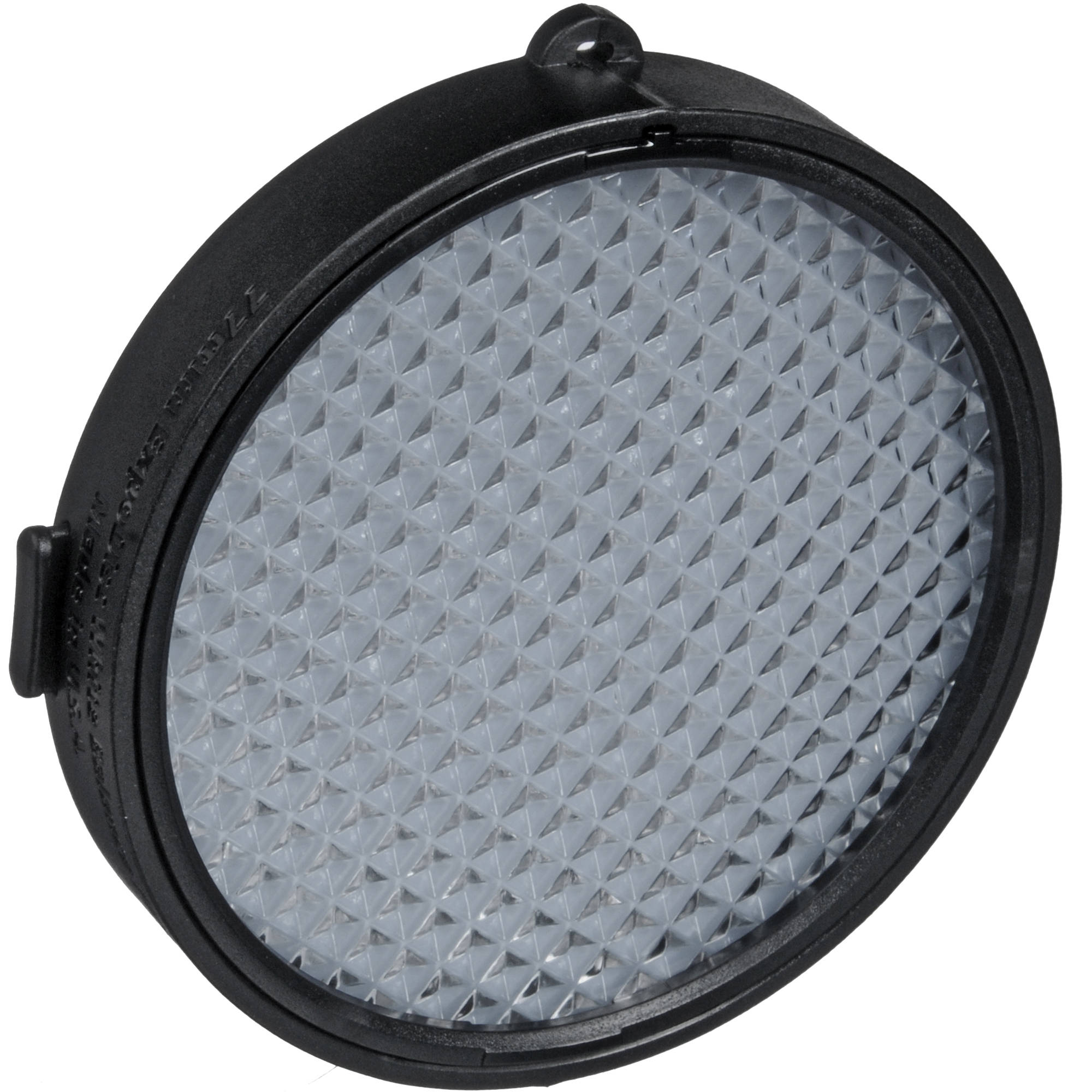
Sometimes we will get a tool, like an ExpoDisc for example, that let's us create a custom white balance in the camera to use for a particular lighting scenario, camera and lens. These tools may or may not express themselves as a number in degrees Kelvin. Let's be really clear about this. A professional colour meter costs nearly $2000 on its own. The colour metering in your $500 camera just isn't that accurate. It's like horseshoes, most of the time, it's close enough. The same is true for your $8000 camera, just so you know. The numbers quoted by the camera hardware, or post processing software are relative and because they take tint into account, are not true colour temperatures.
By this point, you may be saying nasty things about your camera, its maker, the person who sold it to you and perhaps even me, for educating you on this topic. Stop worrying because proper white balance is completely subjective and the one that you like the best is the right one for the image. I'm going to show you why this is so next.
When you choose an in camera white balance setting, this setting does show up in the RAW file to be used as a hint by the RAW converter. Since every camera has unique configurations in RAW converters that work and since all RAW converters have subtle differences in them, the camera white balance setting is really just helping you get closer to what you think you saw in the viewfinder. If you are working from an EVF or LCD, they also have their own colour issues, so the concept of correct white balance just launched itself happily into orbit.
And you don't care. Now if you are shooting JPEGs, you care more, because you are baking a white balance into the compressed file. Mostly. However, you can still adjust the white balance along the two axes to a great extent in a JPEG, albeit not as much as you can in a RAW simply because typically 70% of the data got binned during the initial creation of the JPEG. To the point, if your images really matter to you, shoot RAW. Moving on.
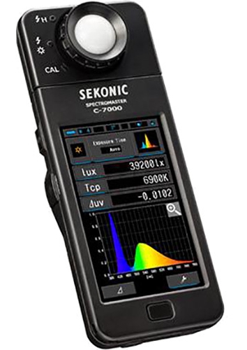
I've done some testing using a colour meter to get the specific Kelvin temperature and to provide me with a tint bias based on the Kodak Wratten, Rosco and Lee filter systems. Suffice to say, these gels were how we matched lights in the old days. I have found that manually entering the data from the colour meter into most post processing software gives me different looks, mostly because of what happens during the software's RAW conversion. Had I been using a professional colour meter like the Sekonic C7000, I would have gotten better readings, but my inexpensive colour meter, meters colour over a time between start and stop. This means that you get a pretty decent average when you have different light sources, but it messes up with low levels of ambient light and high levels of flash, producing a colour temperature reading that is too high by over 1700 degrees. That said, I did not spend $1800 USD on the meter (less than 10% actually) and it serves its purpose. I am no longer in a role that requires exact colour temperature rendition, and given what I have discovered about software, i don't know at the moment how I would get there.
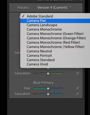
One step to get closer to true neutral RAW conversion is to choose a picture style that is very flat. I always try to use a Camera Neutral, Camera Flat or Adobe Standard style in post processing because this minimizes post processing enhancements. It doesn't impact whatever the RAW converter does, or what was done in the camera, but will get you closer to the real world if that is what you are driving for.
Another methodology that I recently did some side by side testing on is the RAW converter itself. No surprises that the RAW converters in Lightroom/ACR, Capture One Pro, Luminar and ON1RAW produce different looking RAW conversions. It's not a case of one being "better" than another, but they are all different to some extent, driven by the assumptions that go into the RAW conversion process that is unique to each software manufacturer.
This then brings us to the manufacturer's own RAW converter. Some use third party tools, such as Silkypix whereas others, such as Nikon and Canon have their very own home built RAW converters. I had both manufacturer's own software, some RAW images and Lightroom handy so I decided to do a comparison. This is the methodology that I used.
- Import a version of each image into Lightroom and let it do what it does in RAW conversion without any changes. One Nikon image and one Canon image.
- Open the Nikon NEF in Capture NX-D and export as 16 bit TIFF with no other changes at all.
- Open the Canon CR2 in Digital Photo Professional and export as 16 bit TIFF with no other changes at all.
- Bring the two TIFF files into Lightroom and place all four images in the same collection to enable simple use of survey mode.
- Validate the screen calibration for the computer being used.
- Use survey mode in Lightroom to compare both iterations of the same image, one converted in Lightroom and one converted in the OEM's native RAW converter.
Can you guess what I discovered?


You're right. The versions looked different. Not dramatically so, but in both cases, in my very subjective opinion, the RAW conversions out of the manufacturer's own software looked better than the Lightroom conversions.
You can click on the images and download the 100% quality JPEGs if you wish.
Then just for yucks, I did an entire set of images through the OEM RAW converter, converting them to 16 bit TIFF and comparing them to the same RAWs imported directly into Lightroom. This test involved images with exposures that were not optimal as well as those that achieved the artistic intent. Again, my opinion, the OEM RAW converter did a better job out of the gate.
Did it matter? The truth is, not really. I edit my RAW images. Anything that doesn't go to the dumpster, either gets saved for secondary edits, or gets rated high enough to warrant an edit session. The conversions where a place to start. Maybe a miniscule amount of less work on the OEM conversions, but mostly not.

The Datacolor SpyderCheckr. It may not be needed for every shot, but when all your colours as well as your whites, greys and blacks need to be right, this is a very inexpensive way to get there.
I then used some images with the SpyderCheckr in the shot and followed the Datacolor instructions to neutralize the white balance. Worked very nicely. When I tried neutralizing both the LR RAW conversions and the OEM RAW conversions, they neutralized identically, with the only difference being that the LR RAW conversions showed a temperature number and a tint variant, whereas the TIFFs from the OEM RAW conversions showed temperature variances and tint variances but no temperature number.

A RAW file in NEF format imported to Lightroom and then passed through the Datacolor SpyderCheckr plugin that measures all the colours and produces a unique profile for that camera, lens and light source that balances the colour properly. A bit tedious, but once created, that same profile can be used for all the images in the shoot, so long as the camera, the lens and the lighting remain the same.
My next test was to use the SpyderCheckr Plugin to send an imported RAW and an OEM RAW to the Colour Checker software and have it build a profile to fix all the colours to correct for the specific camera, lens and lighting. My setup for this was to use the Nikon D7500 that is on eval with the 18-140 lens mounted on a tripod. My light source was a Profoto B2 off camera firing into a Profoto Silver Parabolic Umbrella Small. I use Profoto strobes because they are colour accurate shot after shot after shot with no variance in colour temperature when checked with a Colour Meter. And that friends, is why I don't use cheap knockoff flashes like Yongnuos. Back on track. The application of the SpyderCheckr profile produced a different result from just neutralizing the white balance using the white balance eyedropper in Lightroom. The colours were more accurate in the image from the plugin, had more richness and yet the neutrals from white to black were not shifted. I then did the same test using the Datacolor SpyderCheckr plugin. It produced an identical final result. As you can see, in the test image above, it includes the larger Datacolor SpyderCheckr in the image. The best news about doing the entire colour correction process, using either tool, is that you are clean for colour, and can then use your white balance eyedropper to set the balance, completely independently of the colour. This may sound a bit confusing, and it is, until you do it, then there is an Aha! moment and it all comes together.
Do I advocate the use of a SpyderCheckr or Colour Checker Passport? The answer is, it depends. If I am doing work where I know that my output is going for colour and tonal accuracy, the answer is yes. If I know that I am going to use effects, or plugins or LUTs, the answer is no, because I have already decided that I want something different than what is technically accurate. Some may say that this is committing a falsehood, but I make no claims about the work being untouched, or photojournalism, whatever that is anymore. I am quite certain that the sky Vincent Van Gogh painted in Starry Night, did not look like the painting, rather the painting is what the artist saw in his mind's eye in the sky. Personally, I think that the painting is brilliant and it is my preference, although I suspect that a colour photograph made at the same time and place would be interesting to see as well.
What can we conclude from this essay? We can conclude that software makes assumptions during RAW conversion. We can conclude that software uses "colour temperature" as a description of the yellow to blue axis, not as true colour temperature. We can conclude that magenta to green is introduced as a second axis referred to as tint (which is also an incorrect use of the term, interesting but not particularly critical). We can conclude that the numbers shown in software for colour temperature are close, as in lawn darts, not close as in measured in degrees Kelvin. We can conclude that digital photography is a creative process governed by our own subjective views and preferences and that "right" is a continuum based on the goals of the artist.
After reading this, are you more comfortable with the difference between white balance and colour temperature? Are you annoyed? Have you decided that you care a whole lot less about the numbers and more about what you like? Share your perspectives and views in the comments section.
If you shop with B&H Photo Video, please consider doing so through the link on thephotovideoguy.ca as this helps support my efforts and has no negative impact whatsoever on your shopping experience. If you find the podcast or articles of value, consider clicking the Donation tab in the sidebar of the website and buy me a coffee. Your donation goes to help me keep things going. Email your questions on any photo or video topic and I will try to respond within a day.
I'm Ross Chevalier, thanks for reading, and until next time, peace.


