

Q & A : Explain the difference between Relative Colorimetric and Perceptual Rendering Intent in Printing
/To submit a question to Q&A at The Photo Video Guy, just put your question into an email and send it to ross@thephotovideoguy.ca Darren writes "Does anyone have an answer for the Rendering Intent to use? I researched found Relative Colorimetric is more accurate but may produce some Banding. Perceptual will not result in banding but the color may not be as saturated or accurate. In a Henry's printing class, using A Canon 9000 and Canon paper, I was told to have everybody use Relative Colorimetric. Everyone's prints looked like monkey poop. When I had them switch to Perceptual their prints looked much better. Most of their prints had greens and green foliage."
I think this is a great question because it confuses many photographers printing at home and because the explanations are often not very useful as I have seen. I'll take a shot at this.
Let's agree that different mediums display colour differently. The old CRT produced colours that look different from the IPS LED LCD displays of today. Images that are backlit look different from those that are projected. Prints look different based on the surface texture and finish of the paper.
I've written lots about the importance of profiling your display before you edit, and recently answered a question from Denis on printer profiling. Darren's question comes out of that answer.
When we edit on our computers and have calibrated the display, we are working with an image that is as close to "real" as we can get. When we go to print the image, even when the printer and paper are profiled or we are using an ICC profile, occasionally an image looks, to use Darren's words, like monkey poo. This typically results from the rendering intent being selected. I did a quick direct survey of folks I know who print on which of relative colorimetric and perceptual that they choose and got a resounding "Yes, if the first one looks good I stop, If it looks bad, I try the other one." Effective but hardly scientific.
It's All About the Gamut
What is gamut? Gamut means the complete range or scope of something. In an image, we typically think gamut when we think of the complete range of colours. Printing paper has less colour gamut than a backlit LED powered LCD display. This is why an image that screams at you on screen can have less power when printed. Glossy papers typically have a wider gamut than matte papers, hot pressed papers typically have a wider gamut than woven papers. I use the word typical because it means true most of the time but not always.
In this example, we see the gamut for the different colour spaces we could use in editing. This image comes from a great document on Adobe's site called Color Managed RAW Workflow. It was written by the inestimable Jeff Schewe. You can download the document here. The document was written to help people make better prints using a much older version of Photoshop so it is a bit dated. The concepts contained therein remain absolutely viable.

We can see the horseshoe shape of visible colour and we can also see the gamut limits of the three main editing colour spaces along with an overlay of the gamut response of 2200 Matte Paper. Plainly, working in the sRGB colour space is going to produce severe out of gamut situations and the image is going to look crappy. If we were to use the Adobe RGB colour space, there's only a tiny bit of out of gamut area, in the yellow/orange area. If our image doesn't have much in those colours we might be ok, but if it does, a little tuning can adjust it to fit the capability of the paper.
We work very hard editing our images using Curves, Tonal Mapping, HDR and push pull tools to maximize the dynamic range (number of stops rendered) and colour space. Most serious editors know not to edit in sRGB or even Adobe RGB but to instead use ProPhoto RGB. These are all good steps but it could start to fall apart when we go to print.
Rendering Intent
Inks and papers will sometimes not have the gamut of the final image. This translates to mean that the colour range of the image extends beyond the capabilities of the media to represent it. While there are four rendering intents in general, only two are worked with when making photographic prints. They are Relative Colorimetric and Perceptual.
The question you as the artist has to determine is what you want to happen when the gamut of the original exceeds the capability of the media. There are two options provided. In the first option, called Relative Colorimetric, we accept that there are out of gamut colours and are comfortable with losing them. Just has excessive overexposure causes highlight clipping, we can say that in this model we have colour clipping. The colours that are in gamut for the media are rendered accurately but colours outside the gamut are lost entirely. This can produce images that don't look complete, or overly flat. The colour is right, but there is stuff missing.
The alternative is Perceptual. This is the equivalent of compression. We take the image gamut and compress it to fit into the gamut space of the media. We don't lose any of the colours, but we concede colour accuracy as all the colours get shifted subtly to make space for the entire image gamut in the more limited gamut of the media. This is the generic default when your printing application doesn't ask you which one you want. The colours are not bang on right but as much of the colour gamut as possible is preserved through the compression. Colours towards the middle of the gamut, (see the illustrations) shift less than colours towards the edges. If your image is composed of a lot of colours toward the gamut edges you aren't going to like it much.
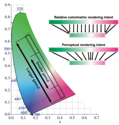 In the image at left you can see the clipping that occurs with out of gamut colours when using Relative Colorimetric. You can also see the compression of colours that occur with Perceptual. The graphic is from a longer article by the great people at Photozone.de. Click here to read it. Selecting the rendering intent is often done first. I propose doing it last. Let me tell you why .
Getting to the Print
In Adobe Photoshop Lightroom 5, Adobe added Soft Proofing. It's in the Develop module and users sometimes get very confused why it isn't in the Print module since you are using it for printing. The rationale to put it in Develop, according to Adobe folks I spoke to at Photoshop World, is that making a proof is like making a unique edit. They're right, because I have printed the same image on vastly different papers and ended up with different edits for different papers.
Basically you do your edits and when you are ready to print, and have set up the Print module, you jump back to the Develop module and click the button to turn on proofing. Then you MUST select the ICC profile for the printer / paper you intend to use. If you don't do this, don't even bother going through proofing. What Adobe has done, is to attempt to show you what the printed image is going to look like and how it will be different on different papers using the printer you selected.
What this function will do is show you where your image and rendering intent will work and where they will start to fall apart. You can now start moving your edit sliders and curves around to pull the proof image back into a pleasing output. It's really very powerful. Where it frustrates people is when they have punched clarity, saturation, blacks, whites, hues and sharpness very hard to get a screen image they like only to discover it will look like turtle puke when printed. This is a great tool as well to help decide what paper you will print on.
Let's start with a RAW image right out of the camera. No processing done to it at all. It's not a particularly interesting image but it does have areas of high colour saturation, one of the first places where gamut boundaries get exceeded.

Note the red berries. Even with no editing done, we could have a gamut problem as we will see when we switch to a Soft Proof view of the same image.

Even in a low quality web image you can see that the soft proof will not look the same as the RAW image. The colours are flatter, and I've turned on the gamut output device warning so those red berries have a marker on them to show that with the current image settings, this print will be out of gamut.

In this smaller image you can see the out of gamut warning indicators on the berries themselves. This means that if we were to print this as is, the berry colours would be out of gamut. They're out regardless of which intent we use, but the flattening will be greater if we choose Relative Colorimetric. If we were to choose Perceptual the entire image colour palette will be compressed.
 Take a look next at the Soft Proof panel that appears when Soft Proofing is selected. Here we can see the paper ICC profile being used, in this example Red River Paper's wonderful Polar Pearl Metallic using the driver for the Epson 4900. We see that the intent being displayed is Relative Colorimetric and that we have set Lightroom to simulate the paper and ink. That last setting is critical to be able to do the next step in making a great print that doesn't cross an out of gamut threshold. And it is incredibly easy.
Next we see a capture of the full Lightroom screen.

I've made a Proof Copy to start. This allows me to start with my edited version and makes a new Virtual Copy specifically to be adjusted using Soft Proofing to correct for out of gamut conditions. In addition to the basic development settings, I draw your attention to the use of the Targeted Adjustment Tool (TAT) in both the Tone Curve and HSL panels. By placing the TAT on the areas being flagged as out of gamut, I can make specific adjustments to correct these areas without changing the entire image. Here even thought the out of gamut warnings are still active, they are not showing up because I have been able to leverage the point selection power of the TAT to subtly manipulate the Tone Curve and the Saturation by colour. I always try to manipulate the image to achieve an intent of Relative Colorimetric first because it holds all the colours and keeps them accurate. If I cannot get there entirely, that's when a flip to Perceptual will typically bring everything in line. It's subjective at this point of course.
The really good news is that now when I print this image on the Red River Polar Pearl Metallic, it will look like it does on the display. I find the paper and ink simulation to be very good, as close as one can come when the edit is backlit and the final print is reflective. It's still a boring shot, but now at least it has good colours with no colour out of gamut.
I want to thank the great people who came before me and shared their knowledge such that I could teach myself and eventually share my learning with others. And if you have questions, don't forget to send them in to ross@thephotovideoguy.ca


